INFINITYUNIVERSE
An editorial product layer designed to organize a growing digital universe.
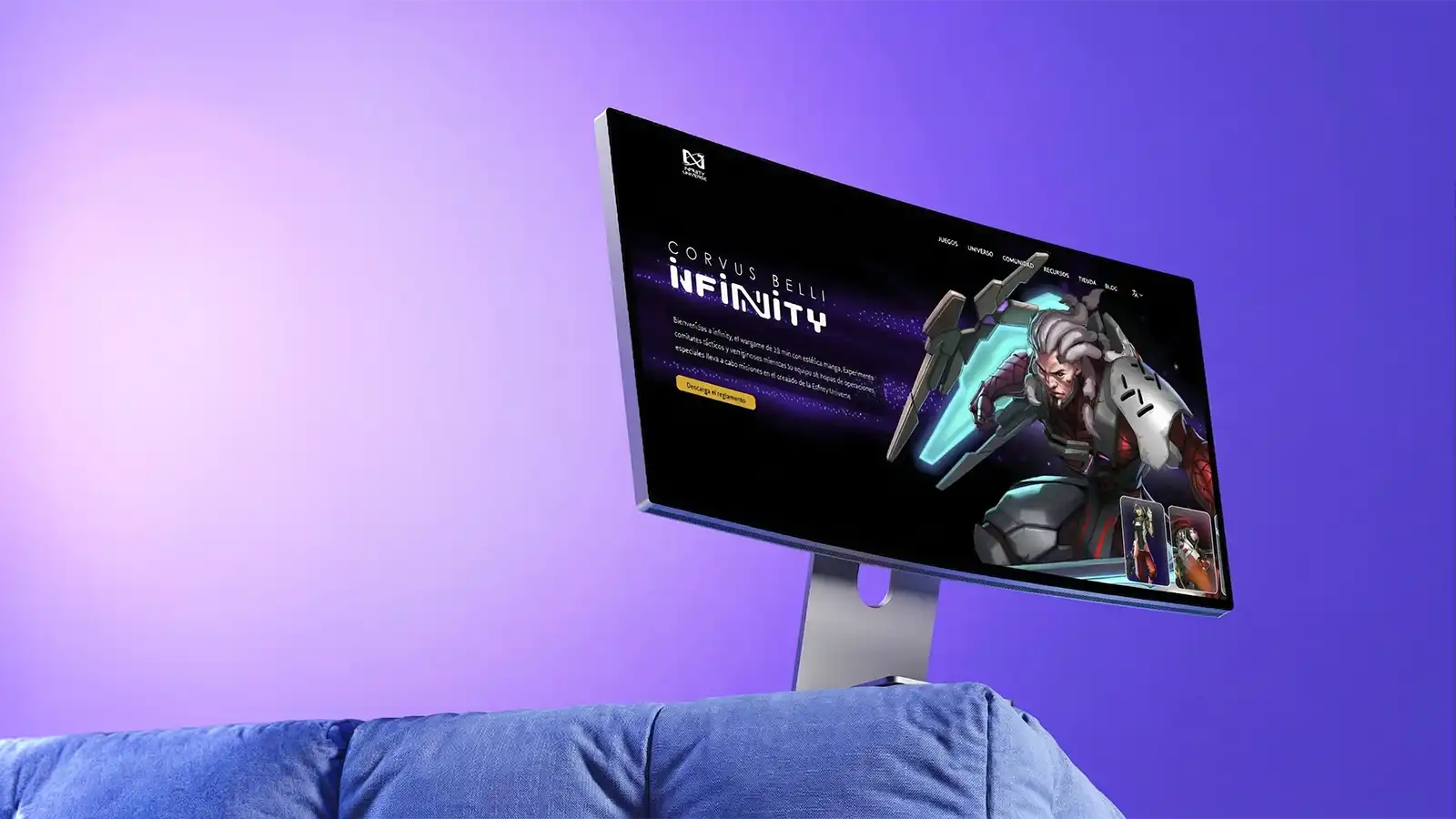
Infinity translates brand ambition into a focused digital experience.
Every transition is designed to feel cinematic while staying conversion-driven.
This space is a placeholder paragraph that we can replace with final copy later.
Infinity transforma la ambicion de marca en una experiencia digital enfocada.
Cada transicion busca sentirse cinematografica sin perder foco en conversion.
Este bloque es un texto temporal y lo sustituimos luego por la version final.
How do we deliver product-level depth with editorial clarity at the same time?
The structure follows an Offbrand-inspired cadence: large beats, controlled reveals, and scroll-linked feature panels. Visual language stays native to your portfolio.
A project page built to present Infinity with clearer storytelling, stronger visual hierarchy, and a system ready to expand without losing identity.
Universe layers arranged like an editorial grid.
A premium placeholder panel for future product imagery focused on hierarchy, faction entry points, and worldbuilding navigation.
Universe layers arranged like an editorial grid.
A premium placeholder panel for future product imagery focused on hierarchy, faction entry points, and worldbuilding navigation.
Organize complexity without flattening the world.
The challenge was not simply to make a better-looking website. The platform needed a clearer structure for multiple layers of information: factions, releases, product surfaces, brand context, and visual depth.
The experience had to carry that volume with a cleaner reading rhythm while still feeling unmistakably Infinity rather than a generic polished interface.
Clearer hierarchy for universe, product, and current releases
A better balance between impact and readability
A foundation ready for future campaigns and editorial moments
Reusable modules built to support changing releases and campaigns.
This placeholder stands in for future UI captures showing scalable components, release blocks, and content composition.
Build a system, not a one-off screen.
The solution was approached as a system: reusable modules, composition rules, and a visual direction capable of growing with the platform without breaking the browsing rhythm.
That means treating the frontend like editorial infrastructure: blocks that can adapt to different stories, launch cycles, and business priorities without requiring a full rebuild every time.
Modules designed for different content densities
Components aimed at real reuse
Subtle motion for continuity and focus
A storefront rhythm that can speak to players, collectors, and product launches.
A generic cinematic panel reserved for final launch imagery, commerce touchpoints, and campaign storytelling.
Motion and detail that hold a premium feeling together.
Execution leans on smooth transitions, layered depth, and compositions that unfold with the scroll. The goal is for each section to arrive with an editorial rhythm while preserving clarity and performance.
Where final screenshots are not available yet, this first version reserves premium placeholder panels and stable aspect ratios so the case study can evolve later without structural changes.
Reveal and parallax motion with reduced-motion fallbacks
Sticky sections that create narrative cadence
16:9 placeholders ready for direct asset replacement
System decisions and delivery scope
Full-Stack Development
Frontend Architecture
UI Systems
Motion Direction
Frontend architecture for editorial and product surfaces
A modular visual system prepared for future views
Content hierarchy for universe, product, and launch moments
Motion design that supports reading instead of distracting from it
A durable editorial home for Infinity inside your own domain.
This page gives Infinity stable search visibility and long-term storytelling ownership, while preserving room to replace placeholders with final assets later.